

Product Design


Lay of the Land
In June 2024 I redesigned Schwab’s Managed Account statements with a 10 week timeframe.
Managed Accounts are utilized by the highest-net-worth customers of banks and brokerages.
Professional financial advisors manage the wealth of these customers with different investment strategies. Our project would be to design for both the customer and the financial advisor.
Successes
- Led end-to-end research, design, and testing of high-fidelity redesigns for Schwab's Managed Accounts reports, shipped within a 10-week timeline
- Authored a comprehensive design brief that aligned stakeholders on process, scope, and milestones from day one
- Facilitated twice-weekly client critiques and workshops that kept design decisions grounded in stakeholder and business needs
- Designed and ran user testing that surfaced key usability gaps between customer and advisor needs
- Synthesized testing data via affinity mapping into actionable design changes, directly shaping the final statement layouts
- Delivered developer handoff documentation alongside final designs, ensuring a smooth transition from design to implementation
The Challenge
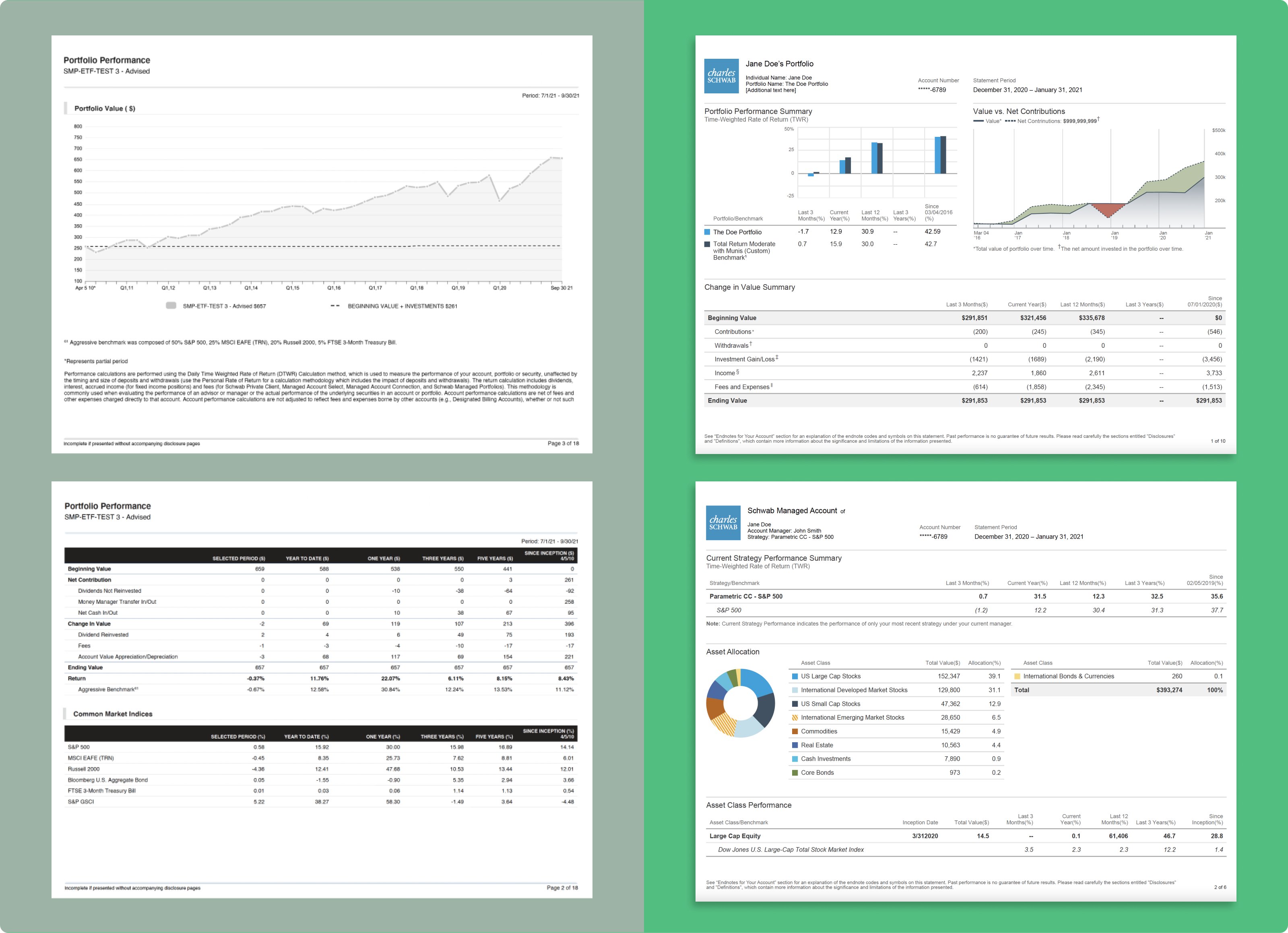
The outdated and contextually complicated data-visualizations of the old-style statements needed to be brought into a cohesive whole. Designs needed to be user tested to confirm UI and layout design met the needs to the exacting end user. Phase one of this project was for printable PDFs and so contrast and legibility even in black and white was important.
Above and beyond the visual/data design challenges of this project, we would need to create a designs that satisfied two user-bases:
- High net-worth clientele
- Schwab’s Financial Consultants
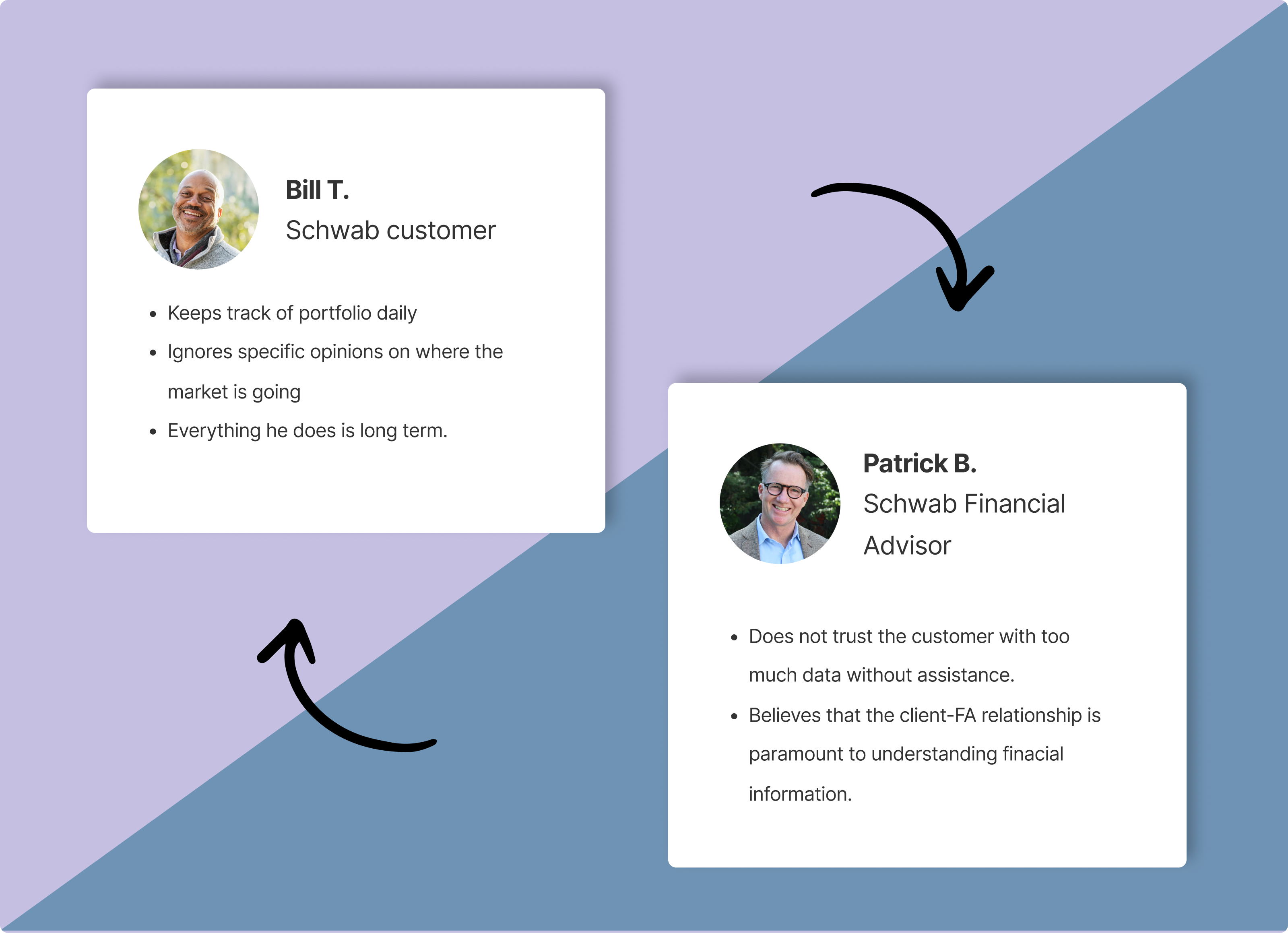
We needed to design for both Schwab customers and Schwab Advisors
Approach
- Competitive Analysis: Our first job was to complete a competitive analysis with examples we had on hand from past agency work.
- Research: In order to gain insights on best-practices within the field of bank and brokerage statements we utilized our agency’s library of previously created work. Utilizing this library was expedient because it is challenging to obtain statements unless you are a client of said bank/brokerage. With our examples we conducted a competitive analysis of statements feature sets and informational modules.
- Content Analysis: Next, we needed to catalogue each data module in the statements by purpose and investment strategy. At this stage we worked closely with the business stakeholders at Schwab to bring a hierarchical clarity to each module and how it fit into the larger whole.
- Wireframes: Creation of low to high-fidelity designs based on an existing design system. These designs would then be user tested with both clients and Schwab Financial Advisors.
- User-Testing & Affinity Mapping: Based on user data from interviews we used affinity mapping to synthesize user testing findings to fine-tune the designs to match specific themes we found.
- Hi-Fi Designs: Armed with catalogued user data we finalized designs and created developer handoff documents.
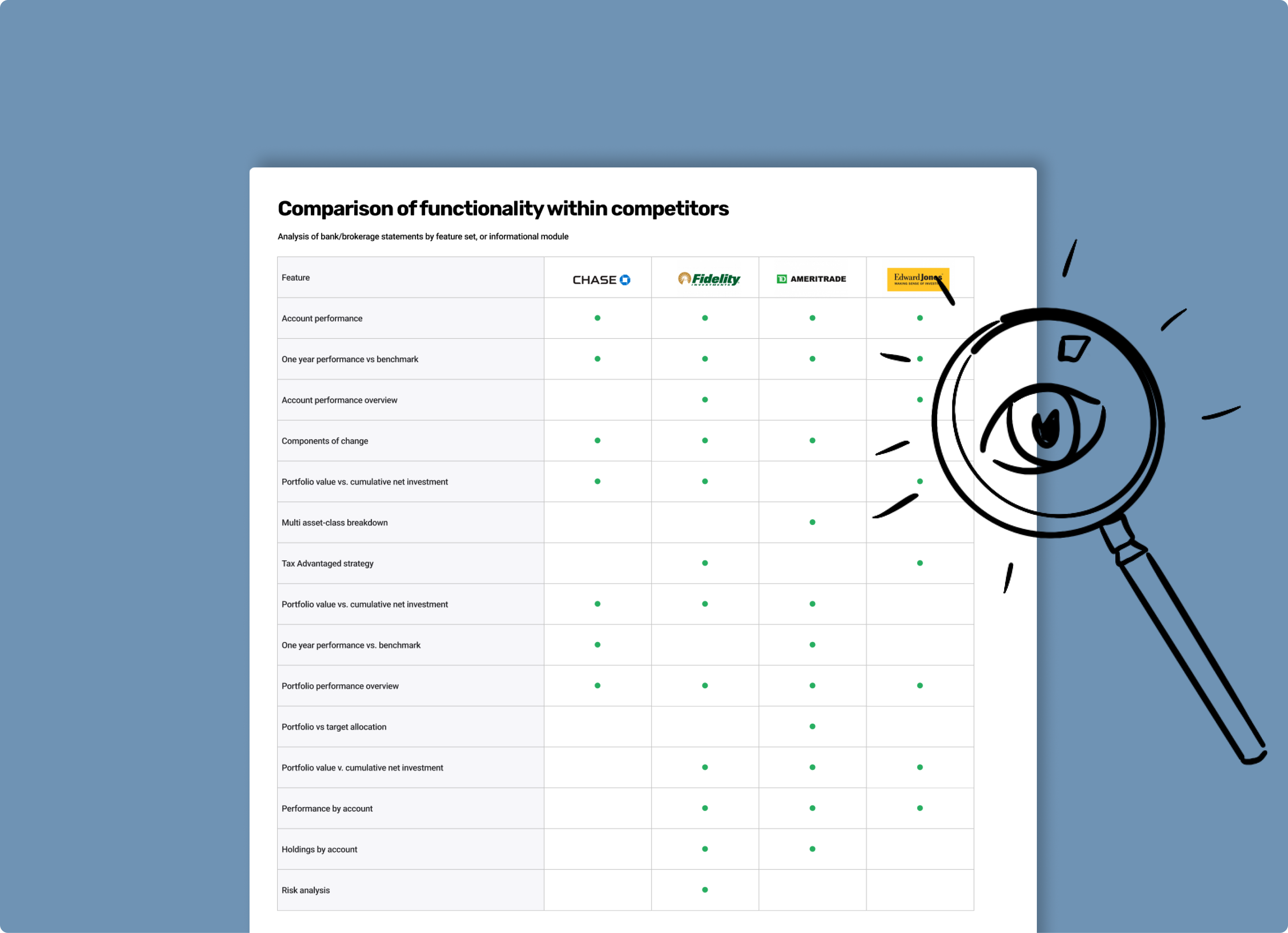
Competitive analysis
Virtual Collaboration
Working together with our client in a cloud-based whiteboard like Figjam streamlined these early stages of the design process and enabled clear communication. We used Figjam to establish a coherent layout of each data module inside of each statement.
With our stakeholders we utilized the interactive whiteboard to get sign-off on layout. Once we were all happy with the initial layouts, we moved on to high fidelity designs of each module.

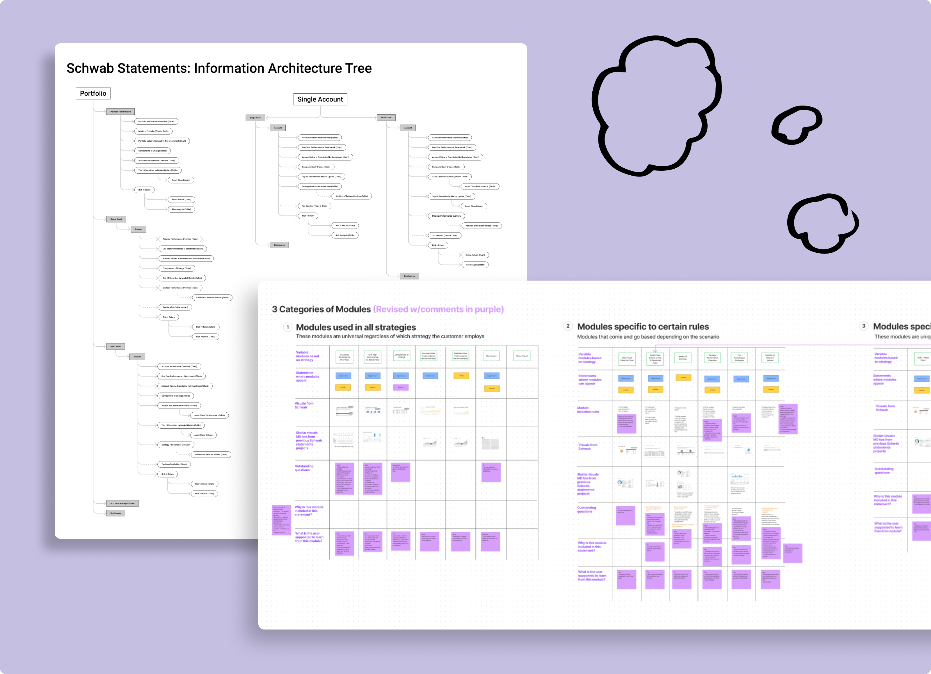
We used Figjam and Figma to work through multiple discovery phases like information architecture
Revamped UI
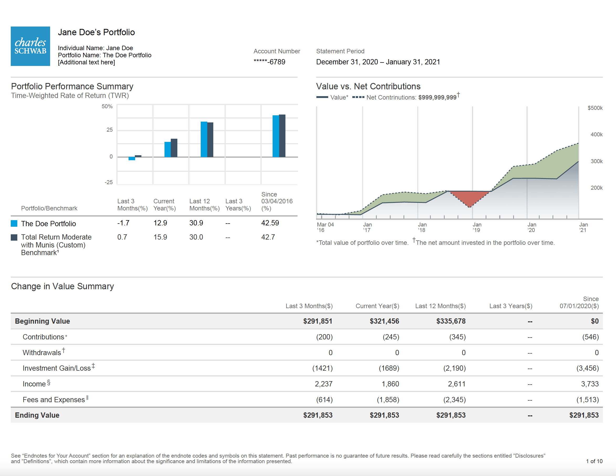
Each data-visualization from old to new needed a full UI revamp. Even if the module was a seemingly cut-and-dry table, there were opportunities to bring visual upgrades. At this point we hadn’t reached user testing so we leaned heavily on previously established styles.
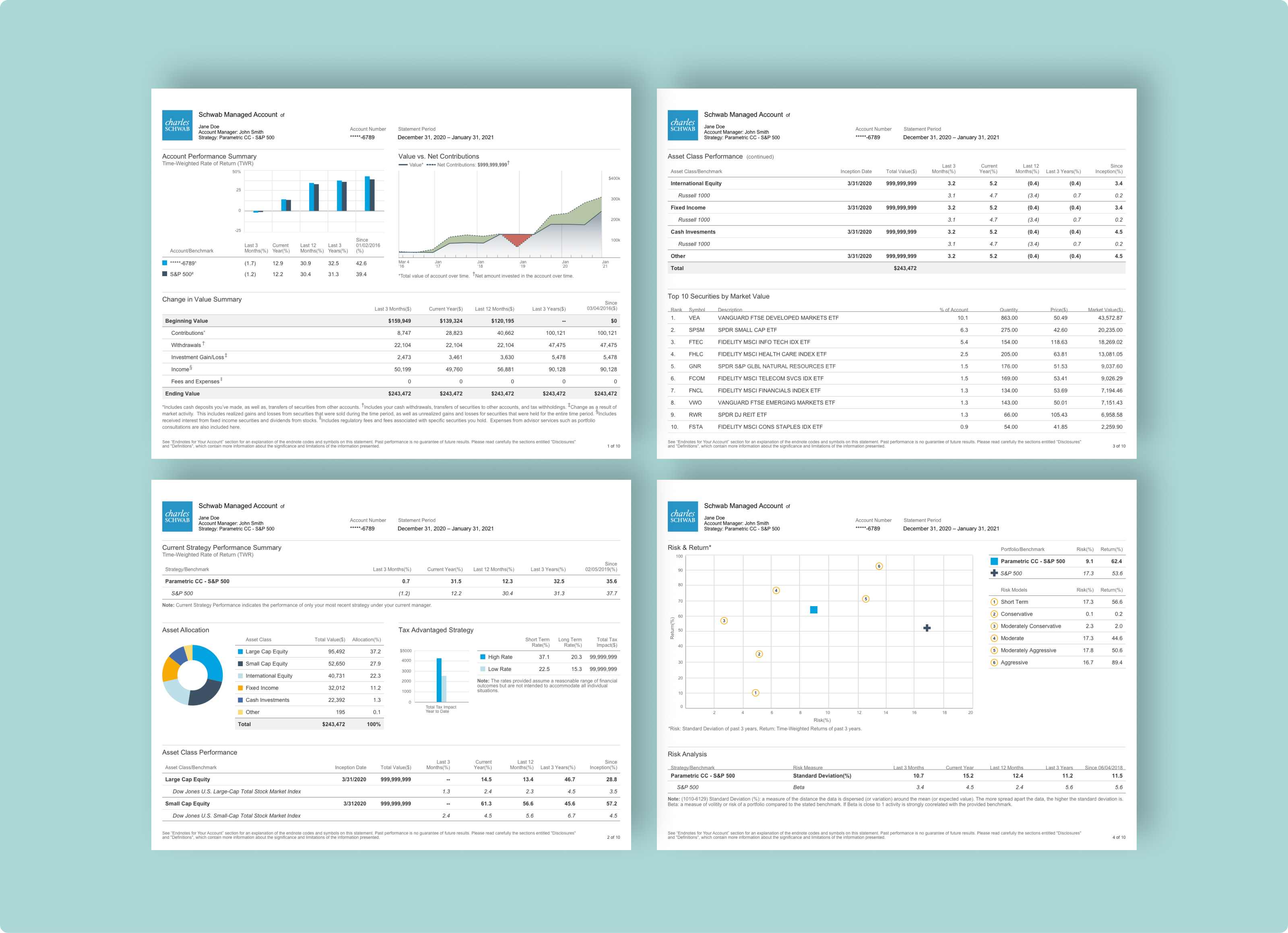
Redesigned statements
User Testing
A few weeks of user testing with both Schwab customers and Financial Advisors revealed important strategy shifts in layout and module design. We gained insights that were both granular and broad. We utilized affinity diagramming to synthesize our large amount of findings
Customers wanted to see:
- Account/portfolio balance as clearly as possible
- Clear delineation between each of the modules in the statement
Schwab Financial Advisors wanted:
- Specific complex data to be explained well on page so that the user could navigate the statement on their own if needed
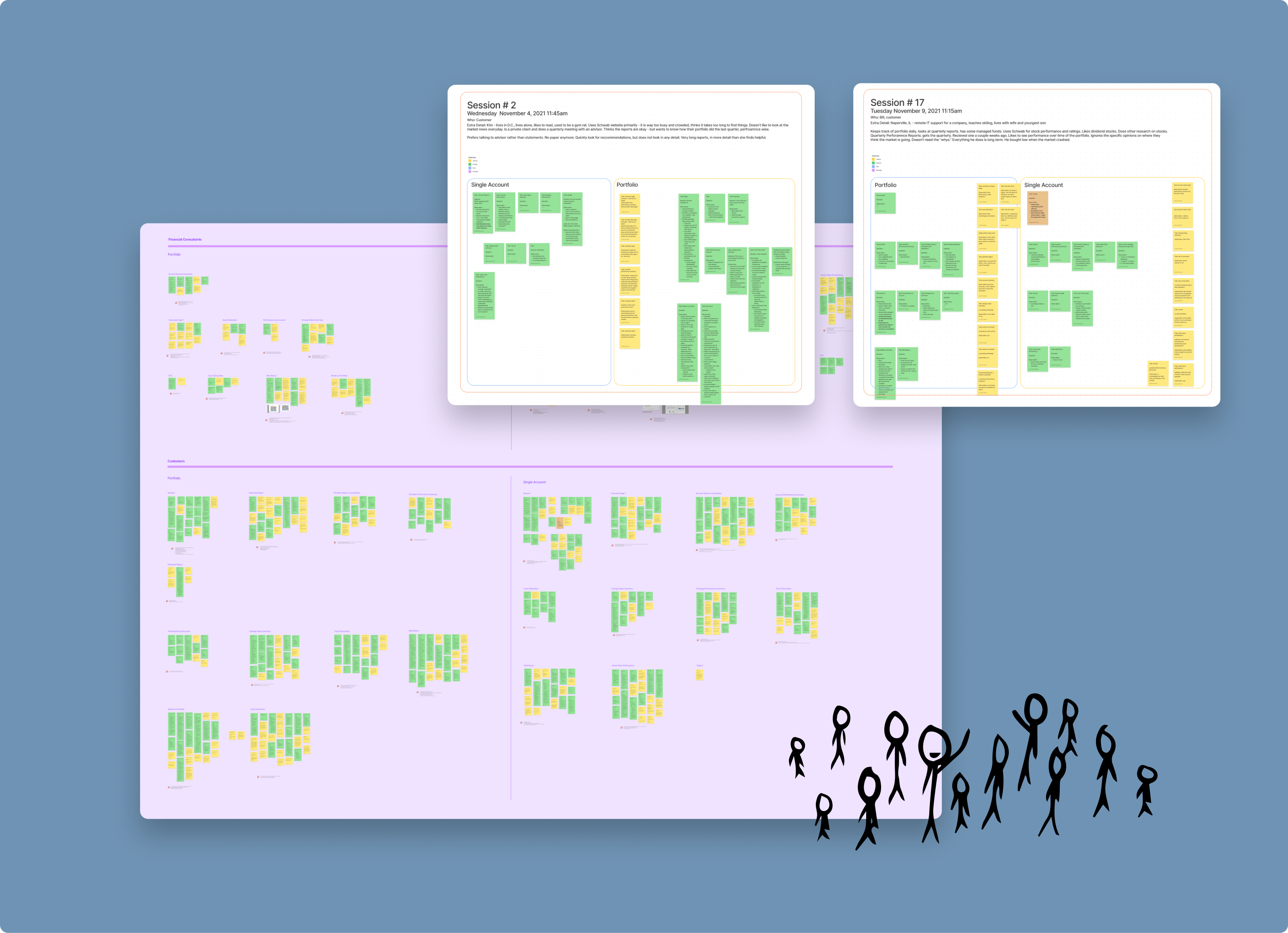
We put our designs through dozens of rounds of testing and then collated the results with affinity mapping
Results
- Phase 1 has been implemented and these designs are now part of the PDF Managed Account statements. Because of the success of the design, Phase 2 will be implementing this experience for the web.
- Schwab now has three completely redesigned Managed Accounts statements which help Schwab’s highest earning clientele to understand the performance of their accounts and portfolio.
- Schwab Financial Consultants now are also able to better serve these clients as a result of this redesign because the data contained in the Managed Accounts statements is more conversational.




Jeremy Hamann
Redesign of Outdated Managed Account Reports.
Product Design
UX Research
Fintech
June 2024
Lay of the Land
In June 2024 I redesigned Schwab’s Managed Account statements with a 10 week timeframe.
Managed Accounts are utilized by the highest-net-worth customers of banks and brokerages.
Professional financial advisors manage the wealth of these customers with different investment strategies. Our project would be to design for both the customer and the financial advisor.
Successes
- Led end-to-end research, design, and testing of high-fidelity redesigns for Schwab's Managed Accounts reports, shipped within a 10-week timeline
- Authored a comprehensive design brief that aligned stakeholders on process, scope, and milestones from day one
- Facilitated twice-weekly client critiques and workshops that kept design decisions grounded in stakeholder and business needs
- Designed and ran user testing that surfaced key usability gaps between customer and advisor needs
- Synthesized testing data via affinity mapping into actionable design changes, directly shaping the final statement layouts
- Delivered developer handoff documentation alongside final designs, ensuring a smooth transition from design to implementation
The Challenge
The outdated and contextually complicated data-visualizations of the old-style statements needed to be brought into a cohesive whole. Designs needed to be user tested to confirm UI and layout design met the needs of the exacting end user. Phase one of this project was for printable PDFs and so contrast and legibility even in black and white was important.
Above and beyond the visual/data design challenges of this project, we would need to create designs that satisfied two user-bases:
- High net-worth clientele
- Schwab’s Financial Consultants
We needed to design for both Schwab customers and Schwab Advisors
Approach
- Competitive Analysis: Our first job was to complete a competitive analysis with examples we had on hand from past agency work.
- Research: In order to gain insights on best-practices within the field of bank and brokerage statements we utilized our agency’s library of previously created work. Utilizing this library was expedient because it is challenging to obtain statements unless you are a client of said bank/brokerage. With our examples we conducted a competitive analysis of statements feature sets and informational modules.
- Content Analysis: Next, we needed to catalogue each data module in the statements by purpose and investment strategy. At this stage we worked closely with the business stakeholders at Schwab to bring a hierarchical clarity to each module and how it fit into the larger whole.
- Wireframes: Creation of low to high-fidelity designs based on an existing design system. These designs would then be user tested with both clients and Schwab Financial Advisors.
- User-Testing & Affinity Mapping: Based on user data from interviews we used affinity mapping to synthesize user testing findings to fine-tune the designs to match specific themes we found.
- Hi-Fi Designs: Armed with catalogued user data we finalized designs and created developer handoff documents.
Competitive analysis
Virtual Collaboration
Working together with our client in a cloud-based whiteboard like Figjam streamlined these early stages of the design process and enabled clear communication. We used Figjam to establish a coherent layout of each data module inside of each statement.
With our stakeholders we utilized the interactive whiteboard to get sign-off on layout. Once we were all happy with the initial layouts, we moved on to high fidelity designs of each module.
We used Figjam and Figma to work through multiple discovery phases like information architecture
Revamped UI
Each data-visualization from old to new needed a full UI revamp. Even if the module was a seemingly cut-and-dry table, there were opportunities to bring visual upgrades. At this point we hadn’t reached user testing so we leaned heavily on previously established styles.
Redesigned statements
User Testing
A few weeks of user testing with both Schwab customers and Financial Advisors revealed important strategy shifts in layout and module design. We gained insights that were both granular and broad. We utilized affinity diagramming to synthesize our large amount of findings
Customers wanted to see:
- Account/portfolio balance as clearly as possible
- Clear delineation between each of the modules in the statement
Schwab Financial Advisors wanted:
- Specific complex data to be explained well on page so that the user could navigate the statement on their own if needed
We put our designs through dozens of rounds of testing and then collated the results with affinity mapping
Results
- Phase 1 has been implemented and these designs are now part of the PDF Managed Account statements. Because of the success of the design, Phase 2 will be implementing this experience for the web.
- Schwab now has three completely redesigned Managed Accounts statements which help Schwab’s highest earning clientele to understand the performance of their accounts and portfolio.
- Schwab Financial Consultants now are also able to better serve these clients as a result of this redesign because the data contained in the Managed Accounts statements is more conversational.

Jeremy Hamann
Redesign of Outdated Managed Account Reports.
Product Design
UX Research
Fintech
June 2024
Lay of the Land
In June 2024 I redesigned Schwab’s Managed Account statements with a 10 week timeframe.
Managed Accounts are utilized by the highest-net-worth customers of banks and brokerages.
Professional financial advisors manage the wealth of these customers with different investment strategies. Our project would be to design for both the customer and the financial advisor.
Successes
- Led end-to-end research, design, and testing of high-fidelity redesigns for Schwab's Managed Accounts reports, shipped within a 10-week timeline
- Authored a comprehensive design brief that aligned stakeholders on process, scope, and milestones from day one
- Facilitated twice-weekly client critiques and workshops that kept design decisions grounded in stakeholder and business needs
- Designed and ran user testing that surfaced key usability gaps between customer and advisor needs
- Synthesized testing data via affinity mapping into actionable design changes, directly shaping the final statement layouts
- Delivered developer handoff documentation alongside final designs, ensuring a smooth transition from design to implementation
The Challenge
The outdated and contextually complicated data-visualizations of the old-style statements needed to be brought into a cohesive whole. Designs needed to be user tested to confirm UI and layout design met the needs to the exacting end user. Phase one of this project was for printable PDFs and so contrast and legibility even in black and white was important.
Above and beyond the visual/data design challenges of this project, we would need to create a designs that satisfied two user-bases:
- High net-worth clientele
- Schwab’s Financial Consultants
We needed to design for both Schwab customers and Schwab Advisors
Approach
- Competitive Analysis: Our first job was to complete a competitive analysis with examples we had on hand from past agency work.
- Research: In order to gain insights on best-practices within the field of bank and brokerage statements we utilized our agency’s library of previously created work. Utilizing this library was expedient because it is challenging to obtain statements unless you are a client of said bank/brokerage. With our examples we conducted a competitive analysis of statements feature sets and informational modules.
- Content Analysis: Next, we needed to catalogue each data module in the statements by purpose and investment strategy. At this stage we worked closely with the business stakeholders at Schwab to bring a hierarchical clarity to each module and how it fit into the larger whole.
- Wireframes: Creation of low to high-fidelity designs based on an existing design system. These designs would then be user tested with both clients and Schwab Financial Advisors.
- User-Testing & Affinity Mapping: Based on user data from interviews we used affinity mapping to synthesize user testing findings to fine-tune the designs to match specific themes we found.
- Hi-Fi Designs: Armed with catalogued user data we finalized designs and created developer handoff documents.
Competitive analysis
Virtual Collaboration
Working together with our client in a cloud-based whiteboard like Figjam streamlined these early stages of the design process and enabled clear communication. We used Figjam to establish a coherent layout of each data module inside of each statement.
With our stakeholders we utilized the interactive whiteboard to get sign-off on layout. Once we were all happy with the initial layouts, we moved on to high fidelity designs of each module.
We used Figjam and Figma to work through multiple discovery phases like information architecture
Revamped UI
Each data-visualization from old to new needed a full UI revamp. Even if the module was a seemingly cut-and-dry table, there were opportunities to bring visual upgrades. At this point we hadn’t reached user testing so we leaned heavily on previously established styles.
Redesigned statements
User Testing
A few weeks of user testing with both Schwab customers and Financial Advisors revealed important strategy shifts in layout and module design. We gained insights that were both granular and broad. We utilized affinity diagramming to synthesize our large amount of findings
Customers wanted to see:
- Account/portfolio balance as clearly as possible
- Clear delineation between each of the modules in the statement
Schwab Financial Advisors wanted:
- Specific complex data to be explained well on page so that the user could navigate the statement on their own if needed
We put our designs through dozens of rounds of testing and then collated the results with affinity mapping
Results
- Phase 1 has been implemented and these designs are now part of the PDF Managed Account statements. Because of the success of the design, Phase 2 will be implementing this experience for the web.
- Schwab now has three completely redesigned Managed Accounts statements which help Schwab’s highest earning clientele to understand the performance of their accounts and portfolio.
- Schwab Financial Consultants now are also able to better serve these clients as a result of this redesign because the data contained in the Managed Accounts statements is more conversational.